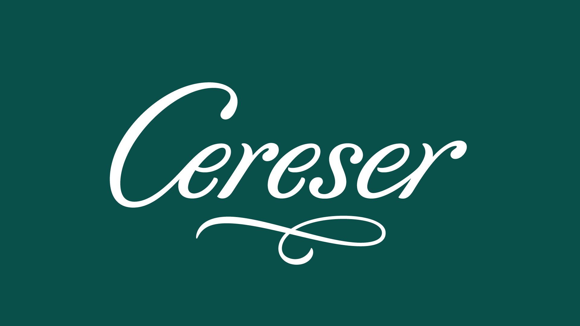
Cereser
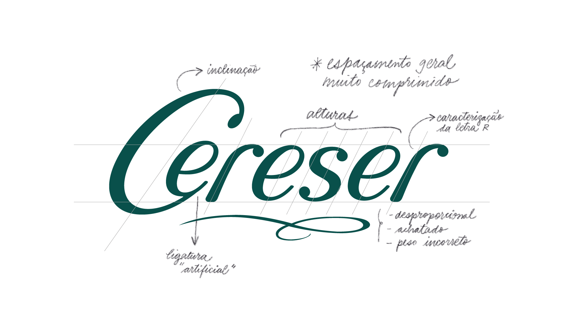
Redesign do logotipo da marca de bebidas Cereser. O projeto teve como objetivo renovar a identidade visual da marca, diferenciando-a dos concorrentes da categoria e aproximando-a de um público mais sofisticado, sem perder a pregnância visual construída ao longo dos anos. O logotipo anterior apresentava problemas estruturais de desenho, que foram corrigidos nesta versão. O novo desenho propõe maior gestualidade e delicadeza, incorporando elementos sutis da caligrafia cursiva. Projeto conduzido pela Pande Branding & Design.
(EN)
Logo redesign for the beverage brand Cereser. The project updated the brand’s identity to stand apart from competitors and appeal to a more sophisticated audience while preserving its visual recognition. The new lettering refines structural issues in the original logo and introduces a more gestural and delicate character inspired by cursive calligraphy. Project lead by Pande Branding & Design.
Logo redesign for the beverage brand Cereser. The project updated the brand’s identity to stand apart from competitors and appeal to a more sophisticated audience while preserving its visual recognition. The new lettering refines structural issues in the original logo and introduces a more gestural and delicate character inspired by cursive calligraphy. Project lead by Pande Branding & Design.
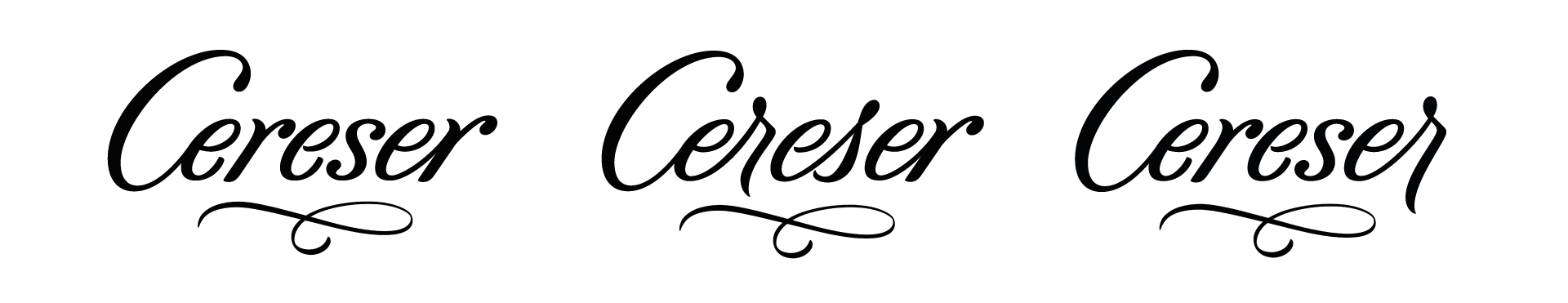
Após uma série de estudos, foram desenvolvidas três versões do logotipo, organizadas de acordo com o grau de proximidade com a versão anterior (da mais fiel à mais ousada).
(EN)
After a series of studies, three logo versions were developed, organized according to their degree of proximity to the previous version (from the most similar to the most daring).
After a series of studies, three logo versions were developed, organized according to their degree of proximity to the previous version (from the most similar to the most daring).